Thursday, May 31, 2012

Daidoji Tametaka WIP


Sneak preview of my latest L5R remake, Daidoji Tametaka.  I don't actually play L5R, but after doing some reading about the clans, I think I'd totally be a Crane Clan kinda guy.

Tuesday, May 29, 2012

Sneak Attack final


Barring any minor changes, I think I'm pretty much done with this remake of Sneak Attack.  I'm satisfied with how this turned out, though I know I have a long way to go.  I like the contrast of blues and reds that I used, although I'm still having a hard time handling color, especially when using color in a more abstract sense, ie to reflect a mood rather than reality.

I've posted the original card art next to my version for contrast.  You'll notice that it's got a similar layout, with ninjas in the foreground and their target in the background.  This wasn't intentional, but after thumbnailing for a while I just ended up back to that basic composition and decided not to mess with it.  The biggest change is in the color scheme.  I must admit I was a bit confused when I first saw this card.  I'm not wholly familiar with L5R (though maybe I should be) but in general I know that cards will have a certain color scheme that pertains to a clan's colors.  Similarly Magic:The Gathering's card art will have color schemes that match the element of the card that you're using.  At first I tried to stick with the original card's color scheme, a contrast between purple and yellow.  It looked okay, but when I laid the image over the card it didn't seem to work very well.


By playing with the hue and saturation levels in Photoshop, I arrived at a color scheme that I liked which matched the card's colors much closer.  Even though it was a bit of a departure from the original card art, I think that these colors look much better, and make the art much stronger.  Many thanks to Felipe Gaona for his valuable input into my work.  Now it's time to figure out what card to do next!

Wednesday, May 23, 2012

Coloring is a Bitch

Last week I showed off the work Id done on Sneak Attack, my latest remake of an L5R card.  I knew that the illustration had issues but I couldn't pinpoint them, and the point at which an artist starts to fumble is usually the best time to reach out for help.  Luckily I stumbled on the website of one Felipe Gaona, a Chilean artist who within two years of hard work was able to snag a couple of L5R card projects.  Since we shared the same goal I thought I'd reach out to him and see if he could help me out.  Turns out he's a super nice guy, and after a few introductory emails I asked him to take a look at Sneak Attack and tell me what he thought.

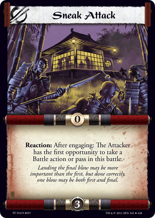
His advice was to sort out the tones in the image first.  Tone is the range of black and white in a picture (or light and dark if you prefer).  It should be used to help highlight the part of the image that you want the viewer to focus on.  In my earlier piece my tones were pretty much in the same range, which means it's hard to visually distinguish the different planes in the piece (The ninjas, the castle, and finally the sky).  In this grayscale version it's easy to see that the focus of the image is the ninjas.  This was a conscious choice based on the fact that once this is shrunk down into a trading card, it would be hard to see any details on the castle anyway, so I might as well shift the focus to the parts of the piece that the viewer can see more clearly.


Since I was going to make such changes anyway, I decided to fix up some compositional issues I had with the earlier piece as well.  I flipped the ninja on the right so that he's now facing the ninja on the left.  This makes it look more like they're having a conversation, and also keeps the viewer's eye from moving out of the image.  I also lowered the castle so that it wasn't distractingly close to the edge of the image, and now it neatly forms a triangle composition with the ninjas.


Now comes the hard part, color.  In this image, I mostly maintain the tones that are set by the grayscale image. It looks okay, but seems a little dull to me.


This other color treatment feels more striking, and the castle and the ninjas both pop out.  But I've basically screwed up the tones that I was working so hard to fix in the grayscale image, so I don't know if this is a good idea.

I'm gonna put this out for critiques again and will get back to you guys next week on what I ultimately decide to do.

Friday, May 18, 2012

Sneak Attack WIP


Sometimes it's more frustrating when an artwork is almost good, rather than flat out bad.  That's how I'm feeling about the second piece in my series that I'm creating as sample card art for L5R, "Sneak Attack".  This is where I'm at so far.  I'm having a lot of trouble with the colors, and balancing the light and dark.  I suppose it serves me right for having focused on just character art for the past few months.  It's made me really rusty with composition.  I'm gonna put this up on the regular art forums to see if I can still salvage this.


On a slightly related note, I made some changes to the previous remake I did, "Introspection."  I made some changes to the lighting and color, blurred out the background some to really bring out the Buddha in the middle.  Got some great advice from the people at wipnation as well as a local art workshop I went to called creationlive!, and I think it really helped improve the piece.


Tuesday, May 8, 2012

Inkwell Ideas' Monster Stand-Ins


I'm finally getting a chance to show off some new finished work here, from Inkwell Ideas' Monster Stand-Ins.  Working on a project like this was really cool.  It's a ways away from my dream of making card art for M:TG or L5R, but its a step in the right direction.  The Lich up there is my favorite of this bunch (as well as Aissa's favorite) but here's some of the other work I did.  These miniature cards are supposed to be a low cost alternative to using actual minis.  If you're interested in learning more head on over to Inkwell Ideas' site for updates.


Dryad


Chimera


Drow Warrior

Friday, May 4, 2012

Dryad Sketches


Been almost a month since I've posted, looking to be more regular this time.  I've said that before though, so you shouldn't hold me to that.  Some Dryad sketches here.  I was in a bit of a hurry due to a deadline so I stuck with two sketches instead of 3 or 4.  I liked the shape of Dryad 1 best, and luckily so did my client, so we're going to go with that.

In other news, I'm attending a pretty cool workshop called creationlive tomorrow at Fully Booked in Fort Bonifacio.  I've been wanting to attend these kinds of art focused workshops and since this is basically happening in my backyard I figured I'd try it out.  It'll be nice to get to know some more local artists and see what the scene is like.