Friday, October 28, 2011

What I learned from the Gobelins Master Class on Animation pt1

A week ago I attended the Gobelin Master Class in Animation in Delasalle CSB.  What intrigued me about it was that the speaker, Alexandre Heboyan, had worked in Dreamworks Animation on the movies "Kung Fu Panda and "Monsters vs Aliens"  I absolutely loved Kung Fu Panda and while I've never watched Monsters vs Aliens I have the art book for both of these movies on my shelf and frequently refer to them when looking for inspiration.  While the class was certainly focused on animation (for example, there were specific example about how long an animation for blinking the eyes should be, I think it was 6 frames) there was a lot in there that is applicable to illustration in general.  I'd planned on writing a wonderful article here that distilled the essence of everything I'd learned into a neat little package of inspirational passages.  But then I got lazy.  Instead I'll just go through the pages of my sketchbook one by one and touch on the specific things that I felt were very useful to me.

Choosing the Right (Camera) Angle


When discussing this topic Alexandre referred to choosing the right camera angle, since animation works in film terms.  He talked about finding the right camera angle for your scene and locking on to that angle.  In terms of illustration the camera metaphor can be useful but if it's confusing just think of it as your viewing angle.  What angle are you looking at your subject from?  What angle best serves your purpose in storytelling? The most striking way he explained it is in the simple illustration above, which I copied from the whiteboard.  In both boxes a sad person is shown.  Neither angle is wrong, per se, but the second one sells the story more.  Why?  Because lets say you blocked the shape in total black, the first illustration would basically look like a lump of unintelligible black mass.  But if you blocked in the second shape, it would instantly read as a sad person, even without any kind of detailing.  To be able to express that emotion as quickly as possible helps you sell the story of the image, which is of sadness and dejection.  There's a note above the second drawing that says "follow the movement/direction".  If ever you're not sure what your angle should be, try to see what direction your character is moving in, what emotion you're trying to express, and set the angle accordingly.

Body Staging


Body staging refers to the positioning of characters in your illustration and how that can help you sell your story.  My favorite example of this is when he talked about two people on a date.  In the first box you can tell that the couple are in love because of their positioning towards each other.  They mirror each other and almost seem magnetically attracted to each other. In the second box is a couple out on a first date.  The one on the right (let's assume he's the guy) is totally into his date and very eager to make a connection.  The girl is a little freaked out and edging away from him.  I love how these primitive shapes clearly explain the relationship between the two characters in an almost yin-yang fashion.  I can imagine this positioning being useful in a variety of illustrations, like ones that show a duel between two characters.  

Silhouette


This rather straightforward and somewhat related to the Camera Angle.  Basically Alexandre was trying to get across that you should always try to make sure that your silhouettes aren't boring.  If the character is shown in an angle that conceals his limbs for example, try to find a different angle where he can be more expressive with his limbs or simply exaggerate his posture somewhat so that the limbs are sticking out and don't just blend into the silhouette of the body.  There are exceptions to this of course, for example if being still or unmoving is a characteristic of your character, or perhaps if the shape of your character's body already shows a good enough silhouette that they're instantly recognizable.

 Using Diagonals


This is something that Alexandre stressed in many of his topics. which is the use of diagonals.  I thought this particular example illustrated it most clearly though.  In the first box is a man who's eyes, eyebrows and smile are all parallel to each other, making for a rather boring image.  Now if it's slightly skewed diagonally, as in the second box, it becomes more interesting.  It reminded me of an age old artistic term, the contrapposto.    The point is to always try to skew things a little bit so that they're not boring to look at. 

I think I'll stop here for now.  Since the following topics I'll talk about all revolve around how to use specific body parts to express emotion, they naturally segregate themselves into another post.  If you have any comments and suggestions please feel free to get in touch with me!

Tuesday, October 25, 2011

Figure Drawing in Pencil 2


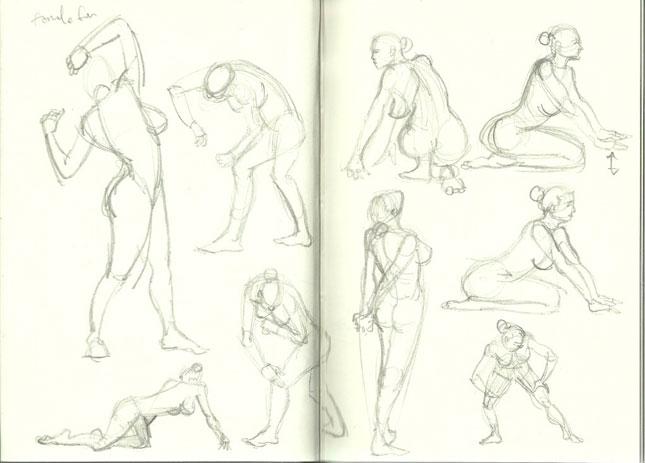
I'm still working up the energy to do a post on what I learned from the Gobelin Master Class in Animation, but in the meantime here's a filler post of more figure drawing, since a lot people seemed to like it (most hits I've had on any post, bizarrely enough).  I'm trying to keep to a schedule of doing figure drawing for 30 minutes every day, and this is part of that series.  Eventually I'll be working with different media like charcoal and penbrush just to keep me from getting bored, so expect more of that soon.


Friday, October 21, 2011

"Water Gun Sky Attack Solves A Problem Like Maria" Back Cover Process pt4

This is the fourth and last post in my series of creating the back cover for Water Gun Water Gun Sky Attack Solves A Problem Like Maria"'s EP "Decompose.  You can find the first post here.

WIP8


At this point of the artwork I'm feeling pretty confident already about things.   I've made some improvements, especially by adding a cement base that can more easily show the impact of the car while at the same time still hold up the sign.

However at this point I'm wary of any more critiques because I'm already starting to feel tired of looking at the same piece for the past couple of weeks.  I should also ideally be able to critique my own work since I won't always have an art director looking over my shoulder.  So I decided to go on my own for the last stretch of the piece, and circled out some areas that I knew would need fixing.

In terms of the flow of the piece, two things really caught my eye.  First was the bit of farmland in between the buildings that is lit up.  This distracts the eye from the flow because it's surrounded by adjoining areas of darkness, giving it more luminosity than it should have. Second is the metal borders of the rooflights.  They hook your eye and distract you from the flow of the piece, which should ideally be from the sign to the girl then following the dirt path to the town.  Other minor issues like blown out highlights also need to be controlled, as well as finalizing what font I'll be using for the sign.

WIP9


Here I've fixed up the lighting issues by adding some elements (the more trees and buildings) to controls the flow of the piece.  This is something that I learned from watching Jason Manley's video.  In the same video he also mentions trying to stick to a 60/30/10 ratio of lights, darks and midtones. For example in this piece I was going for 60% dark, 30%light and 10% midtones.  I didn't quite get it perfect since to me this looks more like 50% dark, 30% light, and 20% midtones.

This is pretty much done.  I'm going to add some textures and weathering to the sign as well as some cleaning up here and there but essentially I'm pleased with this and am ready to wind down.

FINAL


This is the final piece that I will be submitting.  I've added a few textures here and there and some weathering effects to the sign.  I've also changed the shape of the roof lights to make them easier to render and tried to control the lights and darks some more to reach that 60/30/10 goal.  While I'm never really satisfied with my work I can step away from this knowing that I learned a lot, and I hope you guys were able to pick up a thing or two as well.

A lot of help came from the guys at cgsoicety and conceptart.org so I'd like to give them a shoutout.  Lunatique aka Robert Chang was a great help.  If you thought his advice to me was solid you should definitely think about attending his online workshop.  I can't really afford it right now but based on the comments it looks like folks have found it mighty useful in their careers.

If you liked this series of posts or found them useful I'd definitely appreciate a comment and any suggestions to make them even better!

Wednesday, October 19, 2011

Figure Drawing in Pencil 1


Just to break things up a little bit, some figure drawing exercises using the book Body Parts by Simon Jennings. I'm planning on doing a little figure drawing everyday for the next few weeks, so there may be more of this soon.


Tuesday, October 18, 2011

"Water Gun Sky Attack Solves A Problem Like Maria" Back Cover Process pt3

WIP5


In the last installment of this series, I'd just made major changes to the layout of the piece after having come to a point that I thought was acceptable.  Looking at it now I realize that this is a much improved piece, and I'm glad I made that decision.  I made a few changes to the piece since the last iteration, so let me go over them one by one.

The most important change I made was to flip the truck over so that it was facing the sign instead of the town.  I've added to the narrative I created earlier by having Panic crash into the sign while being attacked by zombies, rendering the car useless.  What I like about this is that it gives reason to the sign being there.  It wasn't just up as a composition element but now fits neatly into the story.  Having the car facing the sign also allows me to use its roof lights as a lighting device for the sign.  Although I'm not sure it ultimately matters, this kind of efficient use of space in an illustration tickles my brain and I like to do it as much as I can.

I also changed the background elements some so that the flow of the piece is more clearly illustrated, starting from the sign, some minor emphasis on the zombies, then the girl, then finally the town.  Some of you might notice that I left out the "flow arrow" in the last iteration, and that's because at the time my composition was very broken.  Now it's fixed up so I go once again into a value study.

Value Study 2


After posting I got these replies from cgsociety:


petersk: 
Looks better now. 
The only two crits I have now are that the base of the sign looks more like a fence (I imagine it would be one column, like a billboard), and that you should have a stronger light falloff on the sign in order to look realistically lit by the car lights, except if they are super wide angle.

Lunatique
You previous composition with the moon/building higher was better, because now the sign and the moon/building line up side-by-side and occupy similar amount of space in the image--that's not really a good thing for composition.

According to your narrative, I thing the sign has to look like it's been hit hard and partially destroyed--same with the front of the car. You want to spell these things out clearly, so your audience won't have to guess at what's going on. It's also important to show a couple of zombies as very obviously walking dead corpses, or else they just look like dead people she might have killed. You want to show the rotting flesh, limbs hanging off a tendon, jaw missing, eye missing...etc.

Bearing that in mind, I came up with this:


WIP6


I mostly just started adding color here, and there aren't many major composition changes.  I'm not going to go into too much detail about my coloring method since I conceived of this series mostly as an exercise in composition.  However the simple explanation (for someone well versed in Photoshop) is that I used my value study as a base, then created separate overlay layers for the background (forest, path, town moon, sky etc.) and the foreground (sign, truck, girl, zombies).  I then painted some flat colors on each layer to try to establish a mood. On top of each specific layer I then added a normal layer that I would paint on for the final piece.  These layers are the ones I will spend the most time working on.  It's similar to the method Donato Giancola uses in his oil paintings, except obviously its much easier to do in Photoshop than with oils.

One big difference was Lunatique's suggestion that there was too much balance between the sign and the moon/town, which led to bad composition.  I changed that by making the moon smaller and it made a world of difference.  Everything is much more balanced now and aside from some slight tweaks here and there this will be the base of my final composition.  Which isn't to say there aren't things to work on.  Indeed, after I posted this, I got this comment:

Lunatique
The lighting currently doesn't look convincing because despite your two main light sources being very directional, your main focal point doesn't reflect that enough--it looks too diffused, with too much ambient brightness in areas that are facing away from the light sources. 

Is the red lighting on her from the car's rear lights? If so, you need to consider just how far can the rear lights actually reach behind itself to get to her. Most likely only her feet and calves would be lit by the rear lights, and the rest of her quite dark (being back-lit by both the moon and the headlight bouncing off the sign). You can try to depict maybe a fire close by off camera, so she could be illuminated by the fire.

Now I'll admit that lighting is a very big weak point in my work.  I simply haven't devoted enough time to it to really understand how light works so I don't know that my next step really addressed Lunatique's concerns.  Along with color, lighting is another element of illustration that I need to devote time to.  Bearing that in mind, this is the next WIP I came up with.  

WIP7


I'll leave it at this for now since this post is pretty long.  The next post will be the last one in this series and it'll address the process of cleaning up the image so that everything looks right.  There won't be major changes from this basic painting, but there will be a few key things that I made changes to that I think are very important to discuss.  Till next time!


Monday, October 17, 2011

The Art Department Tutorial Review : Zhang Lu and Jason Manley Portraits volume 1 Caucasian Females


This is probably the first Art Department video that I downloaded that I can comfortably say is not a "must buy".  I was already wary about it from the start but I had a couple of extra dollars lying around from a commission I made so I figured why the hell not?  My trepidation was based on the fact that the video didn't seem to promise very much more than watching a guy paint heads.  While there are many artists out there who would be able to glean hoards of information from that, I am unfortunately more the type that needs to see AND have what he's seeing be explained to him to make that information click in his brain.  Jason Manley bravely tries to do just that in the first 30 minutes of this video, talking about what Zhang Lu is doing onscreen as well as art history and some basic head creation tips.  But even he seems to realize that it's a lost cause and halfway through the video his commentary ends and we're left with Zhang Lu painting to music.

I'm not casting any doubt on Zhang Lu's skill whatsoever, and indeed I'll probably take the time to go back and watch him make paint heads sometime in the future.  However as a sheer value for money proposition you can watch people paint in silence on Youtube.  Or if you want something that can be downloaded that can be watched at your leisure, Carlos Cabrera's got your back.  I actually haven't watched any of his videos so I can't vouch for them, but at least they're free.  I was already disappointed after paying $7.99 for this video, and I can't help but feel I'd be even more disappointed if I'd paid the full $20.

I would highly recommend that you buy some of the other videos that I've reviewed, like Jason Manley on Composition, Jason Chan's set of videos, and Donato Giancola painting "The Mechanic".  You should also download them soon because recently I noticed that some of the videos were going back to regular prices.  I think that the Art Department willbe going through a website overhaul very soon so I'm not sure how long they'll be up there.  Most of the videos  I mentioned above are still on sale but I'm not sure how much longer that's gonna last.

Thursday, October 13, 2011

"Water Gun Sky Attack Solves A Problem Like Maria" Back Cover Process pt2

Be sure to start from the first installment of this series of posts or else this won't make any sense.  If you're read all previous posts, press on!

WIP4


Keen eyed readers might notice that this isn't the exact same image we left off with in my last post.  However in the interest of speeding things up and since there really were only very minor changes between this image and the last one, I wanted to start off with this.

So here I've taken lightship69's idea of a signboard and run with it.  It solved my problem of where to place the album title and songlist perfectly and fits in seamlessly with the illustration.  It also has the neat effect of framing Panic (our protagonist).  Speaking of Panic, I've changed her pose here so that finally she does looke a little tired and weary, almost like she wants to curl up into a ball.  I've added more zombies into the mix to sugest a proper fight took place here.  Lunatique also suggested that I make the moon a little less exaggerated  which I did along with fixing up the town some.

So far I'm really happy.  I like what I've done and I think I'm going to stick to this composition.  With some words of encouragement from the forum goers, I dive into a value study of the image.  Quick note: a value study is essentially painting the image in monochromatic black and white.  You do this so that when you're laying down colors you take one more thing out of the equation; balancing warm and cool colors is hard enough without having to figure for light and dark, so this eases the way for people like myself who aren't fully prepared to grapple with color theory.  Okay so maybe that wasn't a quick note.  Anyway here's the value study I came up with:

Value Study 1


While I knew this image still needed work I felt pretty confident that I was moving along quite well, until I read this post on conceptart.org:


JavierP: 
I realize that this image is for a specific real-world project, but I really think that you should re-visit the thumbnail stage. There are many things that are not working currently that don't involve the composition specifically. The most critical of these issues is the perspective. For example; in the background, one house that appears to be in front of another appears visibly smaller when it should be larger; also the drawing of the truck appears really elongated; lastly the sign posts do not appear to rest on the ground based on the location of the truck.

It may be a good idea to consider the heirarchy of the elements in your image as well. What is the main purpose of the image you are creating? It seems to me that this would be: to show the track numbers and names. By this logic, the track list should occupy a premium position in your image. Right now, in your image, the sign that will have the tracks list, takes up only about one tenth of the image. Elements like the moon and truck are much more prominent(the truck takes up almost half the image). In fact, the order of elements in the image read as moon, then truck, then sign in terms of visual importance. The figures are almost insignificant.

I must admit that when I saw this post I felt really disheartened. I felt like I was moving on to the next step of the image but now I was being told that there may be a need to go all the way back to the thumbnail stage.  Had this been a less informative comment I would have brushed it off and plunged on with the image.  However the amount of care taken with the comment and the fact that he actually made a pretty elaborate thumbnail for me to illustrate what he thought would be a better composition.  I looked long and hard at that thumbnail and felt a bit of panic well up in me; should I go all the way back to the thumbnail phase and do the whole thing over again or should i just try to integrate some of his advice into my current composition?

Ultimately after a lot of soul searching (seriously!) I decided on the latter.  My rationale was that while i realize I could have done more thumbnails for this, I can take that lesson to the next piece I create.  Since this isn't a properly paid artwork and something I'm doing for my own education, I shouldn't worry too much about getting it absolutely perfect.  I'm not going to learn everything I need to learn in a single piece, so I shouldn't feel guilty about accepting the weaknesses of my work ye at the same time acknowledging that I'd learned something in the process.  My guilt now assuaged, I proceeded to start sketching out some quick fixes for the piece:

WIP5


This is still rather rough but since I've decided to post my final composition in the next installment of this series I thought it would be good to leave you with this in between image that I can still comment on.  I fixed the angle of the signboard here, essentially just flipping and enlarging it, and instantly it looked much better.  There's a lot more space for the album title and songs, and they're more prominently displayed, as they should be.  I've made another pass on Panic's pose, basically drawing her in the same pose as before but in front view, which i think accentuates her tiredness even more.  

I also added some story elements that I think aren't very important but help to sell the story a bit.  I removed some of the extraneous zombies but added one in particular in the front passenger side window.  The story I'm trying to tell with this addition is that the zombie broke through her truck's window and damn near killed Panic, so she's in a bit of shock.  It's also the reason she's sitting outside in the back of the truck instead of the relatively safe inside.  It's a tiny story element that almost no one will notice but I think these little story bits help sell the illustration and generally make them more entertaining to create.  

Lastly I pushed the town farther out into the background and simplified its perspective immensely to make my life easier.  Going back to the idea that this is a learning process, I figured I'd learned a little bit about perspective here and I can focus on that more in the future.  There's no need for me to try to learn everything all at once, and no need to introduce a difficult perspective "just because".

Well, that was a mouthful!  I hope you're all finding this as useful as I am.  I'm probably going to release the next installment in the following week but if I get enough comments or requests to do it earlier I just might do it earlier.  So if you're keen to see what happens next please do post a comment here or even email me to tell me to hurry the hell up!

Wednesday, October 12, 2011

Gobelins Master Class on Character Animation


Just a heads up for anyone in Manila interested in learning more about animation concepts.  The Gobelin L'ecole De l'image Master Class on Animation will be holding a workshop in the DeLasalle CSB campus from October 20-22.  Alexandre Heboyan, an artist who has worked on Dreamworks Animation movies like Kung Fu Panda and Monsters vs Aliens, will be the guest speaker.

I'm not actually interested in a career in animation per se, but some animation principles can obviously extend into still illustrations.  The schedule is below, with emphasis on the classes I'm intersted in attending:


Day 1 My Personal Approach for Organizing a Character Animation Sequence
- Getting in a creative mode
- The right method to walk through the animation process
- Key principles of animation

Day 2 How to Bring Life to Your Character
- Bringing expressions out of body articulations
- Breaking down facial features
- Lipsynch method

Day 3 Locomotion and Weight
- How to approach a walk cycle
- Each walk is unique
- Perfect your action scenes

If you're interested check out their Facebook event page or get in touch with Ms. Carla Ting at  carla_ting3@yahoo.com or call 09273810745 Globe/ 0933-313-31-30 Sun.

Tuesday, October 11, 2011

"Water Gun Sky Attack Solves A Problem Like Maria" Back Cover Process pt1

A couple of weeks ago Aissa emailed me asking if I was interested in helping create artwork for a friend's Ep that involved "drawings of zombies and scared people".  I figured this would be a good way keep up my art education while at the same time giving my work a bit of a wider audience, so I talked to Water Gun Water Gun Sky Attack Solves a Problem like Maria's Mia and we agreed over the course of a few emails to have me do the back cover or their EP.

The basic storyline of the album is of a young woman named Panic trying to make her way through a zombie apocalypse to her old house, where she hopes she'll find her boyfriend.  I wasn't given any particular story line to illustrate, so I chose to illustrate a scene where our protagonist runs out of gas right outside the town and is bracing herself to go in and see if anyone's alive.

Over the course of the past week of creating this image it's morphed so much from the original thumbnails that I thought it would be instructive both to me and any readers out there to go step by step over the changes that were made to it.  A lot of the changes were suggested by the people at conceptart and cgsociety, which I will be crediting here.

Thumbnails


Here you can see the thumbnails I sent to Mia to review and choose what she liked the best.  I only showed her the ones that I felt were worth showing, but in total I must have gone through about 15-20 thumbs (not nearly enough, some people would say, and I'd agree).  They chose option 3, a thumbnail that had a relatively simple composition that started from the girl in the truck up to the town and into the moon.  A good enough start, but I could already see that it was going to need changing.

WIP1


Here is the first large WIP using the thumbnail as my base, with some changes in the basic composition. I've changed the flow of the composition by making it in a sort of S shaped form.  I've given some thought to the areas of interest and arranged them according to this flow to end up at the moon, which I hoped to use to frame the 5 tracks of the EP.  I wasn't feeling very confident about this so I put it up on conceptart and cgsociety for feedback and this is what I got:

Tinybird: 
...the story doesn't really come through for me. It looks more like she's waiting a church to explode or waiting someone to come down the road so she can shoot them or something. I don't get a real sense of wearyness or anything like that from her pose and the town doesn't really look like a town either. I figured the zombie thing with the bodies but it's not very strongly conveyed either.

If you change all the main elements to silhouettes, the "town" turns into one large house, her gun and pose are totally hidden inside the car which is also bit awkwardly cropped and one of the bodies is lounging pretty casually.

Also the way she's sitting doesn't fit the car, her lower leg would be phasing through the car to achieve that.

Lunatique:
Your vanishing points all seem to line up (from me just eyeballing it instead of actually measuring), but that wheel looks pretty wonky to me. Why didn't you use the circular marquee tool and then right-click and stroke it? 

Your composition is a bit too evenly spaced between each main element right now. I would suggest varying their spacing a bit. You might also want to overlap the house and the moon a bit--it's a classic composition trick that works every time, creating a compelling contrast of both values and silhouetted shape.

I've put the comments that I decided to focus and work in bold, so you can see my thought process going into the next image.

WIP2

I'm excited to make changes now.  When people give good feedback that I know is workable it excited me to explore their ideas and see if I can make them work in my piece.  Based on teh comment about the truck being cut off, I moved it completely inside the frame.  I changed the protagonist's pose to address the issue of her not looking weary, but as we'll see later on that wasn't a success either.  I moved the town to the right of the image to keep the S flow going, and placed the moon behind it as suggested to enhance the visual interest in the town.

As a result of these changes, all of which I think were for the better, certain unexpected things came about.  The songlist was now floating in space.  This is a bad thing, since the song list is actually the most crucial element of the cover.  I haven't placed much emphasis on it thus far because I got lost in drawing the other elements, but that's something that I'll have to consider later on.  Second, shifting the elements around led to two visual elements instead of four as in the previous image (well, three if you count the songlist, which I really should!).  My gut feel is that this is actually a good thing, and it makes the image more focused.  I put the image up on the forums again and waited for feedback.

Lightship69:
The girl on the truck looks like she is out sun bathing, not resting from a fight.

I would play with the perspective more to go for something that suggests that there is still more road to go, Road sign saying 20 miles to "Zombieville" or where ever she is headed and the road going down to a town in the distance.

Lunatique

I like the changes at the top, and while the changes at the bottom is good too, I think the main focal point is placed a bit too close to the bottom border of the image, making it unnecessarily crowded at the bottom. Try raising the stuff on the bottom a little. 


Also, what if she's actually on the S shaped road and walking towards the building at the top, and there are dead zombies all around the truck?

WIP3


 This is the image that I came up with after the previous round of comments.  This feels much better and getting close to done, but there will still quite a few changes left!  While I was initially going to go over this in red (marker) like the previous images, this post has gone on for quite a bit already and I think it would be better to split it up into two different posts to allow time to absorb all the information here.  I'll put up the next post in a couple of days so stay tuned!


Saturday, October 8, 2011

Illustration of the Week #4: MtG: Even the Odds WIP


I'll admit I've been a little lazy lately and I've mostly been reposting older work. This one's from a the Illustration of the Week challenge on conceptart.org a few weeks back.  We were tasked to reimagine a Magic:The Gathering card called "Even the Odds":

Action: This spell "calls for reinforcements" when you're up against the ropes, in the form of three soldiers. How to represent this is up to you. One idea is to show a fallen soldier whose sword, helm, and shield have fallen onto the ground around him. The armaments reflect the fallen soldier's form, and those reflections have magically come to life and are emerging from the armaments, stepping foot into the real world.

Focus: The arriving reinforcements

Mood: the tide has turned


I really wanted to work on and finish this challenge since one of my end goals is to paint an M:TG card.  I toyed around with it a lot, even experimenting with what I think is a cool framing device for the central character using the bodies and swords of the ghostly reinforcement soldier (see the red outline).  Unfortunately the way I composed the piece doesn't really work very well when shrunk to the size of a magic card.  I was too disheartened to continue the piece, especially since the deadline was so close, so it's another one of those artworks that I've abandoned.  I may go back to it sometime, but I'll likely just try to redo the whole thing instead.


I could just pick out one of the ghostly knight to complete as a rendering exercise, since I kind of like how they turned out, especially the chainmail of the knight on the left. 


I actually am working on something new right now, which I'm going to go more in depth on in my next post.  One of Aissa's friends is releasing an EP and asked some of her artist friends to contribute artwork for it.  I was assigned the back cover, and that's something I've been working on little by little over the past week.  I learned a lot just trying to get the composition right for that, so it's something I'm keen to share with everyone else.


Update: I apologize for the oddness in this post, with regards to the size of the text.  In Blogger's editing mode everything looks fine but when it gets published it's all wonky and I'm too lazy/stupid to fix it.

Wednesday, October 5, 2011

Urban Sketching : Manila Bay


Spent quite some time sketching in Manila Bay the other day while Aissa was taking care of a Synergiea event. The sketch above is probably one of the most polished I've ever done, which makes sense since it took me about an hour to finish it.  I was actually sketching it outside in the wind and rain until some employees of Yellow Cab Pizza took pity on me and invited me to stay inside since there weren't a lot of customers that day. I wanted to order something in thanks but I was really full after one and a half sandwiches at Starbucks, so I slunk away after I was done with my sketch.  This one was done with a pencil outline, then brush pen and gray marker brush for shading.  The little squiggles on the upper right were supposed to be birds flapping in the wind, which I wasn't quite successful with.

This sketch was done in the aforementioned Starbucks.  I must have looked suspicious to the Starbucks crew and customers because I spent maybe 10 minutes just walking around Starbucks trying to find the best view.  These were all sketched in Harbor Square opposite the CCP complex.  I'd actually had no idea that this structure existed before that Saturday, but it's a pretty nice place to go and view the sunset or the boats and yachts moored in Manila Bay with skyscrapers and the piers in the background.

Monday, October 3, 2011

The Art Department Tutorial Review : Donato Giancola's "The Mechanic"


Aissa and I have been watching Donato Giancola's tutorial for the past couple of days and i wanted to do a quick plug for it while it's still on sale.  It's an excellent value since it originally cost $60 and can now be had for only $7.99.  Since these files were originally released on a DVD they're pretty huge so be prepared for some lengthy download times.  I was initially quite surprised that Aissa was drawn into the video since I always feel like art tutorials can be very boring for someone who isn't an art practitioner.  I'd just been watching on my own when she plopped down on the couch and within minutes was absorbed in the video enough that she was concerned that I'd watch it without her.  Perhaps that's testament enough to how good the tutorial is, but I'll try to  go into it in a little more depth here.

Donato goes through his entire process of creating a painting, from photographic reference using a model and still life(s?) to a more refined drawing which he then scans and transfers onto the masonite which will hold his final painting.  Throughout the tutorial (we're only halfway through btw) he drops some very useful advice about portaiture, lighting and color, and his thought process when painting.  I like that he's very liberal with his use of reference material, since there's a stigma among many non professional artists that using reference materials is "cheating".  However he does take pains to say that one should not be a "slave" to reference material, only borrowing from it to help establish your painting more firmly in reality but also knowing when to ignore the reference to suit your own needs.

Digital artists may be hesitant because it's a tutorial about an oil painting, but don't let that deter you.   While I do have aspirations to one day try out oil painting in the future, I can already see ways that I can incorporate his techniques in photoshop by using layers and possibly artrage, which more closely mimics traditional media.  I will also reference this video a lot when I have trouble with choosing colors, especially when painting skin tones and metallic textures because he goes pretty in-depth into discussing what he's doing when he's painting the mechanic's face and armor. He also spends quite some time talking and painting a galaxy as the background for his subject, which is something I'm sure I'll find useful down the line when I try out some science fiction work.

As I said I'm only halfway through but I highly encourage anyone interested in painting science fiction covers, using reference material properly, and learning about light and color to download this tutorial while it's still at the bargain basement price of $7.99.

Update: Definitely get this if you want insight into how light reflects on mettalic objects.  Donato explains that it doesn't always work the way we logically think it does!