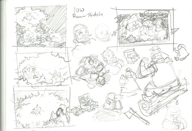
The Illustration of the Week challenge has opened up on the conceptart.org forum, and for the first week we’re suppose to come up with a banner that lists all of the rules of the challenge. The banners are usually illustrations in and of themselves, and it comes with some prestige because everytime a new challenge is posted the banner will be the first thing people see. I’m very skeptical my work will be chosen, but I’m hoping I can pull out something decent. The image above is the first few sketches I made. I was inspired by the idea that illustration is “storytelling”, so the first thing that came to mind was someone telling campfire stories. For whatever reason, I’d first imagined dwarves being the characters.

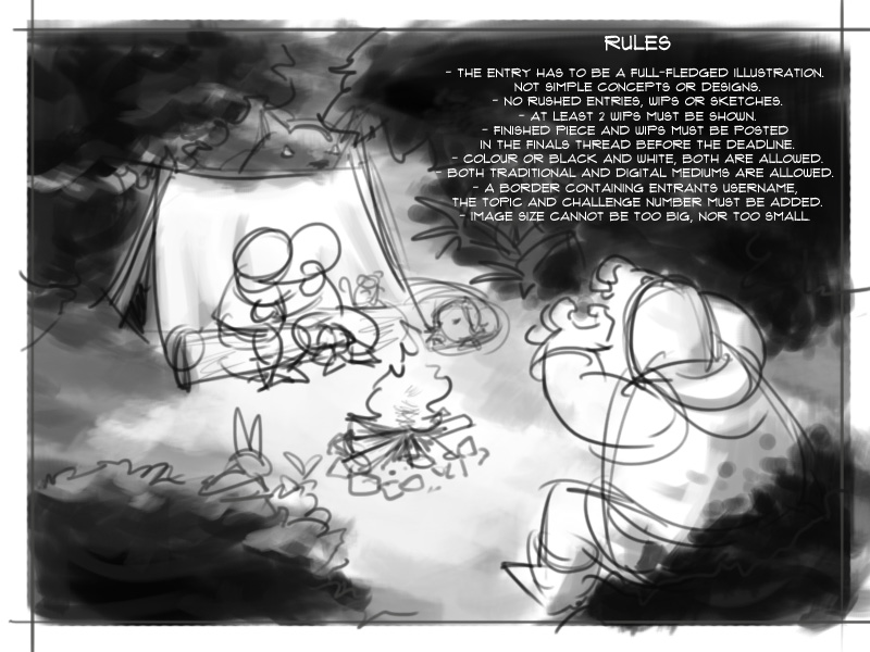
Here’s the first roughs in Photoshop, jsut laying down the basic shapes and some values. I’m experimenting with the chalk “brush” here, which is very useful for laying down values.
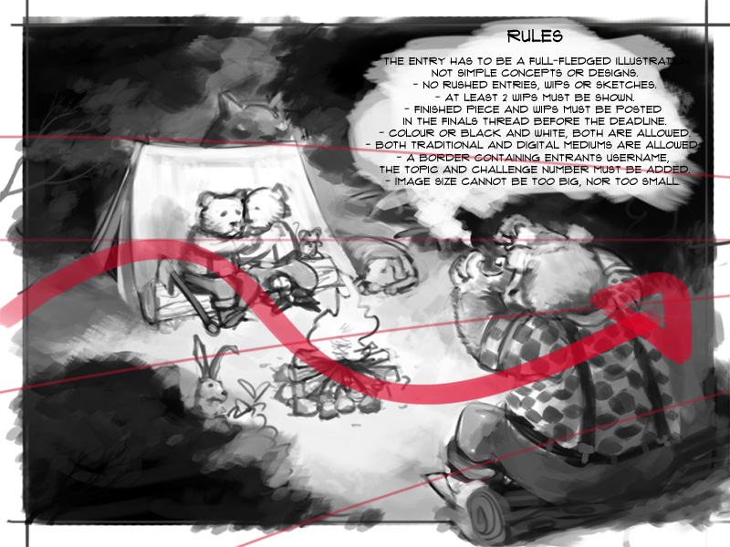
I dropped the dwarves pretty quick mostly because I couldn’t figure out how to draw toddler dwarves with beards that looked like they weren’t old men. Anyway, bears are cuter than dwarves, and lumBEARjacks are the best! I’m trying to create some flow in the scene, after having watched Jason Manley’s very educational series on the basics of design. It’s something I’ve known for a while but for some reason hasn’t stick to me till now. I’m also using very basic perspective to help sort out the placement of the characters and give the image a little more depth.
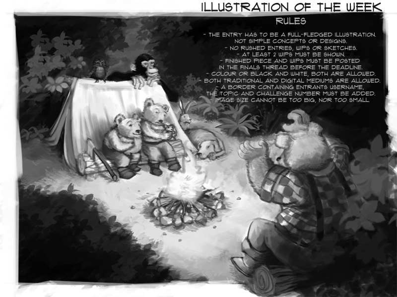
At this point I’m almost done. All that remains is to add some color and do some cleaning up. I’ve made quite a few changes here, like moving the rabbit up behind the dog, replacing the nebulous creature behind the tent with a chimp (Yes, I just watched Rise of the Apes) and an owl, so the bearcubs look like they have a bunch of little friends with them listening to their father lumbearjacks’ story. I’ve introduced a lot of foliage into the scene (I still don’t know how to control that.  ), made one bearcub look interested and the other one afraid for some contrast, and also fixed the father bear’s hands so he looks more like he’s telling a story than trying to strangle someone.
I’m kind of stressed out about this because I think it looks really nice (at least Aissa thinks so) but I feel like something’s still wrong. Hopefully when I put this up on the conceptart forums someone will be able to point out the glaring mistakes. In any case, I have till this weekend to work out the kinks before final submission and voting.


No comments:
Post a Comment