Showing posts with label WIP. Show all posts

Thursday, October 25, 2012

Sneak Peek


Can't really talk about this yet, but wanted to show you a little thing I've been working on every now and then.

Wednesday, October 10, 2012

Xill Borderlands style


This isn't finished, and this isn't what the final artwork will look like.  I've actually been contracted to make a colored and B/W version of the Xill, along with an accompanying background.  While playing around with the layers I thought it looked cool when the line art was superimposed over the colored version, making it look like something out of Borderlands.

Thursday, October 4, 2012

Xill sketches


A few months ago I posted about the work I did for Inkwell Ideas' Monster Stand Ins (available now on RPGNow).  Looks like the project's done well enough for them that they now have another, similar project in the works.  They've contracted me for another monster, this time I'm working on the monster race called the Xill.  This is the description from Paizo:

Xills are the scourge of the Ethereal Plane, conquering everything in their paths with only one purpose: to perpetuate their race at the expense of others. All xills are female and capable of fertilizing their own eggs, but require living hosts to incubate these eggs, which they inject into paralyzed victims by means of a grotesque ovipositor normally kept retracted behind their mandibles. Evil and alien, the plane-shifting xills possess impressive intelligence and a totalitarian, militaristic culture all their own. Though they see most other life forms as incubators, they particularly prize phase spiders for this purpose.
Sketching out the Xill took a long longer than I thought it would, and I sketched stuff like insect heads as well as predator heads and tried to merge those into a really disgusting looking monster.  Inkwell's Joe Weztel chose sketch number 1 from the sketches above, and so you'll see me developing that image in the days to come.

Tuesday, September 18, 2012

Daidoji Tametaka Sketches


So it's been a couple of weeks since I submitted my L5R remakes to Alderac Entertainment.  Since I haven't heard from them at all I have to consider that experiment a bust.  It's obviously a little disappointing since I poured a lot of time and effort (hence the sketches seen above) into those artworks for no pay, but at least I have a few nice new portfolio pieces to show for it.  It's hard to be too sad though, since I'm consistently getting work offers and will actually be working on a couple of fun things in the next couple of weeks, including a LOT of work for the alpha version of Prison Architect.

Friday, August 17, 2012

Shrine to Hachiman WIP


This is where I was at about a week ago.  I thought that this piece was almost done.  I was wrong.  Upon closer scrutiny, there were many things that were wrong with it.  It was kind of soul crushing to realize that I needed to do so much work to fix it, but it was my own fault for not sorting things out in the thumbnail stage (though to be fair I thought I had).  I'll go into more detail about this when I'm finally done with it, but for now marvel at this half finished work.

Friday, July 27, 2012

Oyo Seido Colors


Choosing a color scheme has always been difficult for me, and it's no different with this piece.  My inclination s towards the color scheme with the bright red temple, but I fret over whether this is just because the color red is such an attention grabber.

Wednesday, July 18, 2012

Oyo Seido WIP


Working on this in my off hours.  Slooooowly getting there.  Remake of this card.

Wednesday, July 11, 2012

Landscape Sketches


Apologies for not posting for a month!  I'll try to keep to a once a week track from here on out, but I'm not making promises so why do I bother? (and for that matter why do you?).  Anyway, these are some landscape sketches I made in preparation for my next L5R remake.  It'll be the 4th of 5 and one of two environment pieces.  I drew inspiration from a photobook of China, which I picked up during a sweet National bookstore sale for just 200 bucks.  More next week (maybe)!

Thursday, May 31, 2012

Daidoji Tametaka WIP


Sneak preview of my latest L5R remake, Daidoji Tametaka.  I don't actually play L5R, but after doing some reading about the clans, I think I'd totally be a Crane Clan kinda guy.

Wednesday, May 23, 2012

Coloring is a Bitch

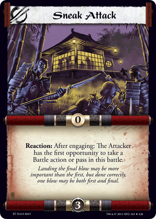
Last week I showed off the work Id done on Sneak Attack, my latest remake of an L5R card.  I knew that the illustration had issues but I couldn't pinpoint them, and the point at which an artist starts to fumble is usually the best time to reach out for help.  Luckily I stumbled on the website of one Felipe Gaona, a Chilean artist who within two years of hard work was able to snag a couple of L5R card projects.  Since we shared the same goal I thought I'd reach out to him and see if he could help me out.  Turns out he's a super nice guy, and after a few introductory emails I asked him to take a look at Sneak Attack and tell me what he thought.

His advice was to sort out the tones in the image first.  Tone is the range of black and white in a picture (or light and dark if you prefer).  It should be used to help highlight the part of the image that you want the viewer to focus on.  In my earlier piece my tones were pretty much in the same range, which means it's hard to visually distinguish the different planes in the piece (The ninjas, the castle, and finally the sky).  In this grayscale version it's easy to see that the focus of the image is the ninjas.  This was a conscious choice based on the fact that once this is shrunk down into a trading card, it would be hard to see any details on the castle anyway, so I might as well shift the focus to the parts of the piece that the viewer can see more clearly.


Since I was going to make such changes anyway, I decided to fix up some compositional issues I had with the earlier piece as well.  I flipped the ninja on the right so that he's now facing the ninja on the left.  This makes it look more like they're having a conversation, and also keeps the viewer's eye from moving out of the image.  I also lowered the castle so that it wasn't distractingly close to the edge of the image, and now it neatly forms a triangle composition with the ninjas.


Now comes the hard part, color.  In this image, I mostly maintain the tones that are set by the grayscale image. It looks okay, but seems a little dull to me.


This other color treatment feels more striking, and the castle and the ninjas both pop out.  But I've basically screwed up the tones that I was working so hard to fix in the grayscale image, so I don't know if this is a good idea.

I'm gonna put this out for critiques again and will get back to you guys next week on what I ultimately decide to do.

Friday, May 18, 2012

Sneak Attack WIP


Sometimes it's more frustrating when an artwork is almost good, rather than flat out bad.  That's how I'm feeling about the second piece in my series that I'm creating as sample card art for L5R, "Sneak Attack".  This is where I'm at so far.  I'm having a lot of trouble with the colors, and balancing the light and dark.  I suppose it serves me right for having focused on just character art for the past few months.  It's made me really rusty with composition.  I'm gonna put this up on the regular art forums to see if I can still salvage this.


On a slightly related note, I made some changes to the previous remake I did, "Introspection."  I made some changes to the lighting and color, blurred out the background some to really bring out the Buddha in the middle.  Got some great advice from the people at wipnation as well as a local art workshop I went to called creationlive!, and I think it really helped improve the piece.


Friday, May 4, 2012

Dryad Sketches


Been almost a month since I've posted, looking to be more regular this time.  I've said that before though, so you shouldn't hold me to that.  Some Dryad sketches here.  I was in a bit of a hurry due to a deadline so I stuck with two sketches instead of 3 or 4.  I liked the shape of Dryad 1 best, and luckily so did my client, so we're going to go with that.

In other news, I'm attending a pretty cool workshop called creationlive tomorrow at Fully Booked in Fort Bonifacio.  I've been wanting to attend these kinds of art focused workshops and since this is basically happening in my backyard I figured I'd try it out.  It'll be nice to get to know some more local artists and see what the scene is like.

Wednesday, April 4, 2012

Drow Sketches


Just a couple of sketches for a Drow warrior, for the Monster Stand-In series.  Been a bit busy lately so I haven't been updating as much, but I'll try to update more regularly soon!

Friday, March 23, 2012

Lich WIP


Delving further into the Lich.   This is based on the fourth sketch from this lineup.  I took inspiration from Egyptian priests when doing the original sketch, but as I progressed on with the final image I felt something was lacking. with his design.  To spice things up a bit, I took the curved edges of his hat and turned that into a motif that repeats across his armor.

Wednesday, March 14, 2012

Lich Sketches


Hey all, apologies for being away for so long.  We've been very busy ruminating at Pintsized Games about what to do with our game, so I've been quite distracted from my art.  I've still been keeping busy though, and here are some sketches I'd like to share with you.

These are thumbnails for a Lich.  Liches are undead creatures formed when powerful people magically bind their souls to an item in order to ensure their immortality.  Said immortality doesn't affect the aging process however, so they all eventually end up looking like your random zombie/skeleton dude, except with some pimping armor and weapons.

 It was incredibly fun doing these thumbnails, something that I choose not to do sometimes because of time constraints.  It also makes sure you only put out your best work, because a lot of the really awful and unoriginal stuff gets left behind in the sketchbook.  I can't say I'll be very rigid about doing thumbnails for all of my future work, but it's something to keep in mind.

Thursday, March 1, 2012

Dire Rat


Are there Dire Mice?  Or are Rats just Dire Mice?  In any case, here is a Dire Rat WIP.  Hm. That right forequarter looks messy.

Friday, January 20, 2012

Earth Elemental Studies Using Silhouettes


I recently got a commission to paint an Earth Elemental, giving me a bit of a break from working on in-game sprites for Prison Architect and the soon to be announced personal game.  At a sale in Fully Booked a couple of weeks ago I bought The Skillful Huntsman: Visual Development of a Grimm Tale at Art Center College of Design. I'm not going into much detail about the book since I haven't read enough of it to do a proper review, but it was suggested multiple times by art podcasts I listen to as a great book for would be concept artists/designers.

One of the methods they use while designing characters is to create silhouettes as thumbnails and then fill in the silhouettes with different details.  Now I've always been vaguely aware of the idea of using silhouettes to design characters, but there's something about the very plain manner they explain it in the book (with visual samples) that unlocked something in my head.

So after a couple dozen thumbnails I decided on three different silhouettes that I like, then made three different concepts using each silhouette,  It's a really fun exercise and you'd be surprised how much variation you can come up with.  This sample is rather easy, since as an Earth Elemental I don't really need to design clothing for it, but I'm eager to try it out on human characters soon.

If you're interested in checking out or buying the book, please do click on the link below, since I will get a small commission from Amazon if you do so.  Thanks!


Wednesday, December 7, 2011

Creature of the Week #239 : The Bakemono that Haunt the Mountains WIP pt1

As I mentioned in a previous blog, I'm starting to get into the groove of the weekly challenges again after a bit of a hiatus.  This week's challenge is to create "The Bakemono that Haunt the Mountains".  From conceptart:

When it comes to creatures, demons come in all shapes and sizes. In most fantasy setting demons have a tendency to to take on very western demonic ideals and we oft end up with the horribly mutated cousins of Tim Curry in Legend. This week we will be taking a look specifically an invented malevolent, demonic creature, but in distinctly Japanese fashion. Now, in Japanese folklore, Bakemono doesn’t necessarily refer to a demon per se, but it does, by definition, shape-shift. Your task this week is to create a type of mountain demon with the ability to shapeshift into some kind of normal animal. As a nod to its origins, the creature should at the very least have a nod to Japanese folklore in its design, in some way.

I did some research on Obakemono and decided I'd like to take a stab at rendering a Tsukumogami, or 100 year old object.  From Wikipedia:
the term is generally understood to be applied to virtually any object, “that has reached their 100th birthday and thus become alive and self-aware.


After browsing the internet and doing research on animals that live in the Japanese mountains I'd also decided that the demonic creature I wanted to render would be a Japanese snow macaque.  In my initial sketches above I experimented with the idea of the demon object being a stone lantern that came to life after a hundred years.  You can see how I tried and failed in the sketches above to synthesize the shape of the macaque and the lantern.  After giving the idea some more thought I decided to try something else.  I'd always been interested in samurais and their accouterments, and the more I looked at the macaques the more their faces reminded me of samurai masks. I made a couple of sketches with this idea in mind and since I was pleased with the result I decided to go that route.


Since I'd already decided what my demon and his animal form would be, I now had to work out how I would like him to be posed.  Keeping in mind what I'd learned from the Gobelin's Master Class in Animation  I wanted to make sure that the silhouette of the characters stood out and that it would "read" properly even without any details.  To aid in this I kept my lines as simple and clean as possible, eliminating and internal detail and focusing on making sure that the body silhouette and that of the mask were most easily readable.  I liked the shapes of thumbnails 1 and 3 the best, although I ultimately settled on 3.  While both thumbnails exuded "evil", thumbnail 3 looked more like a creature that was out to work some mischief, and thumbnail 1 looked more like a guardian, or someone taking a dump.  My thought process was that if I was suddenly animated after 100 years I'd be raring to run around and trick people instead of just sitting still.


With my pose in mind I settled down to create the initial line art for the piece.  After doing some research on Japanese paintings depicting snowy landscapes (which I will go into with a little more detail in my next post) I made some quick thumbnails in my sketchbook and then translated that into Photoshop.  This composition isn't final and I'll be talking about some changes I made to lead the eye more towards the creature, but that can wait till the next post!

Wednesday, November 23, 2011

A Princess of Mars Art Order Challenge (Update)


It's been a rough couple of weeks.  I know I've been slow to update this week, and a lot of that is because I've been busy with my current project (which I'm itching to announce) and also because my sister has just arrived with her family after a decade away from the Philippines so I'm hanging out with her and my niece and nephew, whom I've never met in real life before.

But I've also been battling a strange emotional roller coaster with my art career.  It's too long and involved for me to go into detail right now but I know it's been affecting my motivation to create new artwork, which really sucks.  One casualty may be my "A Princess of Mars" Art Order challenge entry.  The image above is what I've gotten so far, and is likely about as far as I'll go with it.  I'm going to be in Batangas for the next few days relaxing on the beach with my family, so that cuts heavily into any more time that I could spend on this.  Even if I weren't going, I haven't exactly been jumping at the opportunity to work on this like my previous artworks, often I'll make a few desultory brush strokes and then walk of or surf the net for a bit.  It's a very unsettling feeling, and I'm hopeful my beach trip will help recharge me a bit.

Thursday, November 10, 2011

Martian Ships Concepts


I have a couple of preliminary tasks that I set for myself before I actually go ahead and start the final illustration for the Art Order "Princess of Mars" challenge.  The first task is to design a Martian ship.  I must admit I'm really awful at vehicle designs.  Prior to these sketches I did do a few sketches of sailing ships like galleons and even modern ships like destroyers just to get a better idea of the basic shapes and silhouettes of ships.  I even had a look at one of Feng Zhu's free tutorials on vehicle design to try to get my head in the right space, but I just ended up being depressed at how dull my designs are.  As with most things it'll just take me time and a LOT of vehicle concepts to really get better at this.

I think I'm going with ship number 3 just because it looks the least Earth-like.  Next up, I'll have a crack at designing what the green men of Mars look like!